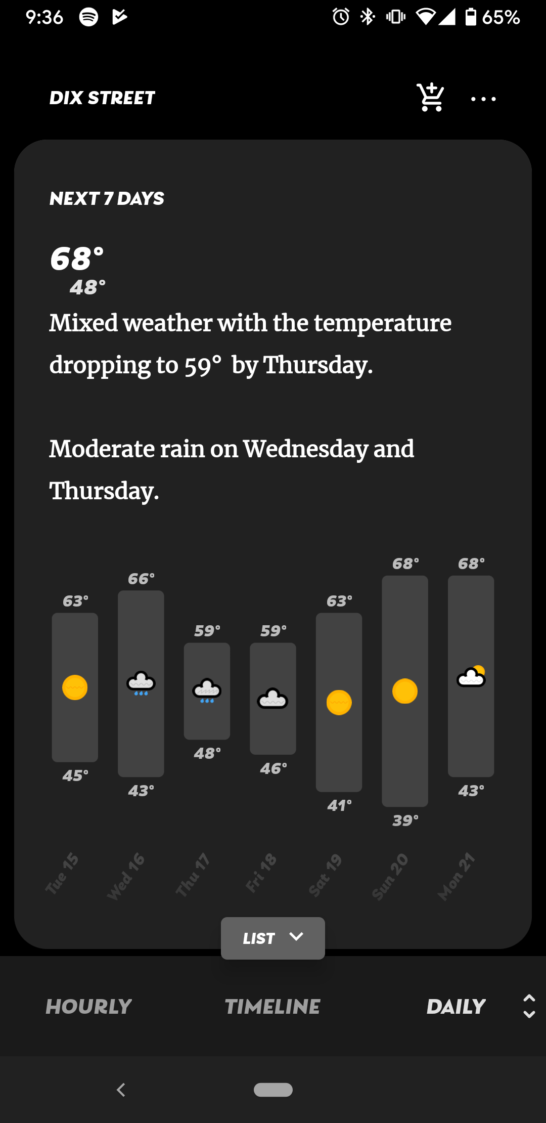
Thanks Bardi! I'm trying to remember the way Merriweather was originally implemented, but it feels like the new font is only applied to certain text elements in a way that comes off a less intentional? To be honest, it also generally feels less "charming" than Merriweather did, but I'm having trouble truly articulating why :/
2.0.29 finally restores a serif as a font pairing option and we call it Classy (: You need to turn it on. Sorry it took so long.
I can look around, but honestly (unless it's not free or not available) I do really like Merriweather! Playfair seems nice, but feels a bit too "fancy" in some of its smaller details, even when selecting a bolder variant. Merriweather seems to hit a sweet spot for me of refined but not overboard, I guess? Again, something that really caught my eye back when I started using the app :)
Agreed. If you have any suggestions for a clean, modern (and free!) serif, let me know. Think Merriweather — the previous serif — is a bit dated right now. Playfair Display is probably my pick at the moment: https://fonts.google.com/specimen/Playfair+Display.
I think perhaps my issues with the new font are that the weight is slightly thinner, and the letter spacing feels comparatively cramped?