
Mar 20
Hourly bar chart suggestions
The bar charts are quite tiny/fiddly in my opinion, even when switching to a 24 hour view. If possible, I would strongly consider several tweaks here:- The hourly chart should be stretched to fill more of the screen, proportionally- currently, at least when it's cold, there's a huge amount of space between the bars and the top of the view. The bars should stretch proportionally to minimize this space, at least to some degree- if the empty space stays (/if there's some amount of room), I would have the temperature and icon pop up above the bar you're holding down on currently (rather than show it at the top of this section- I think the bars themselves would ideally be wider - this could be accomplished by having this part of the page be swipable (as opposed to cramming as much in to this static view). You'd still be able to long press to look at a specific hour, but now you'd have all the space you want to make the individual bars easily interactableI think some combination of the above would help this view tremendously. Honestly, I wouldn't mind also having the ability to see a 12 hour view, and/or have the ability to toggle the chart off in order to just look at the section below it.
Pending
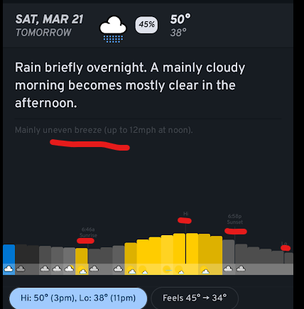
Reprinting the list in this ticket (sorry about that): - The hourly chart should be stretched to fill more of the screen, proportionally - currently, at least when it's cold, there's a huge amount of space between the bars and the top of the view. The bars should stretch proportionally to minimize this space, at least to some degree - if the empty space stays (/if there's some amount of room), I would have the temperature and icon pop up above the bar you're holding down on currently (rather than show it at the top of this section - I think the bars themselves would ideally be wider - this could be accomplished by having this part of the page be swipable (as opposed to cramming as much in to this static view). You'd still be able to long press to look at a specific hour, but now you'd have all the space you want to make the individual bars easily interactable - I wouldn't mind also having the ability to see a 12 hour view, and/or have the ability to toggle the chart off in order to just look at the section below it