
Mar 20
Proportionally stretch the temp range bars in the "next 7" daily view
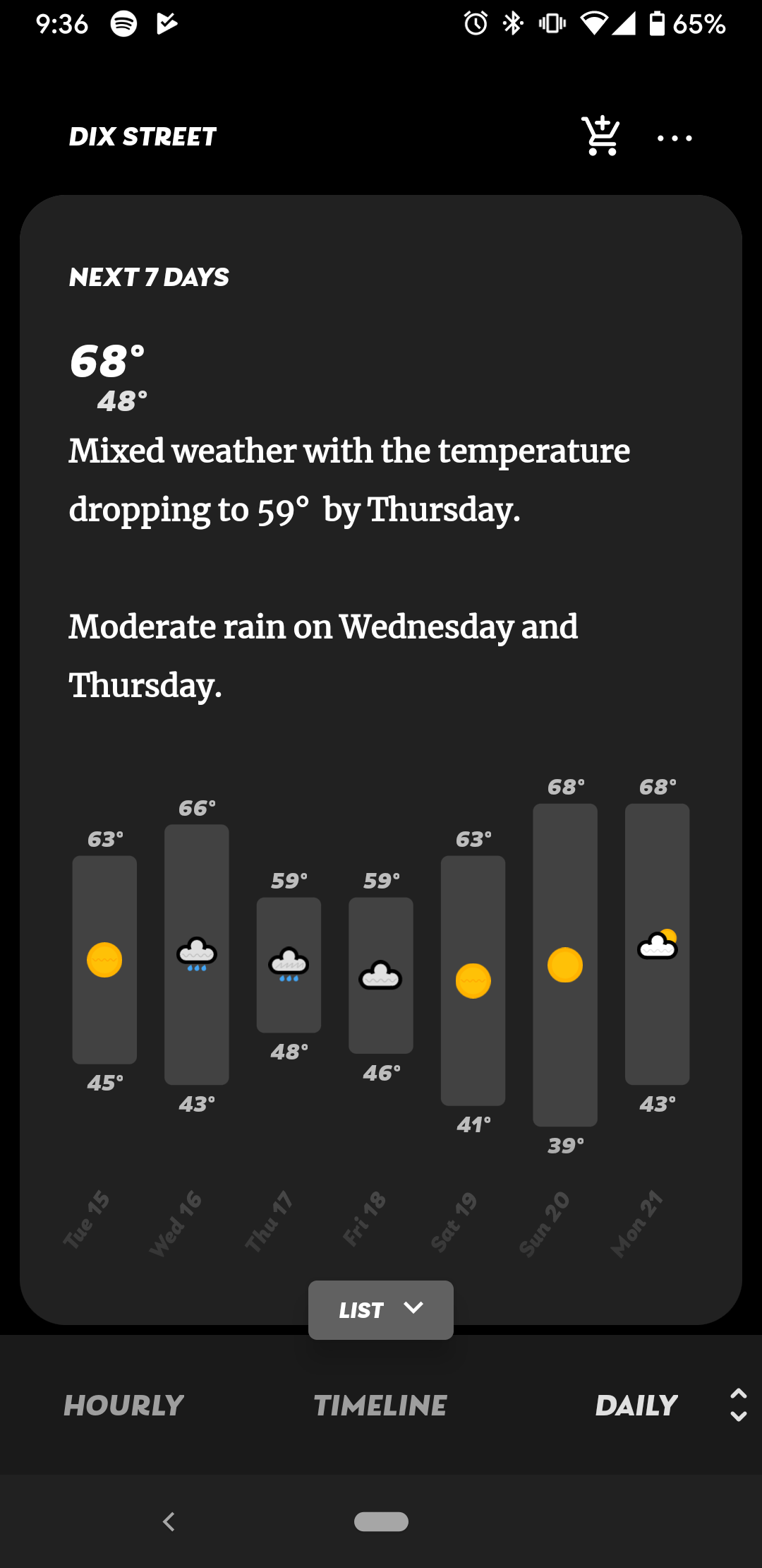
When looking at the "next 7" view on the daily screen of the old app, the comparison bars were much more vertically stretched. I think this was a great choice aesthetically! It also highlights that the current implementation not only feels "scrunched," but also that it leaves a strange amount of empty space between the bars and the dates beneath them.Another upside of vertically stretching the bars again would be that the newly added % chance of precipitation figures should be able to fit in the bars themselves, beneath a precipitation icon (rather than below, competing with the low temp reading. Food for thought?
Pending