
2.0.19

Since re-launching the app at the beginning of the year, the top priority has been to ensure existing users had no negative feelings about the upgrade. It became immediately clear that I had my hands full: missing features and differences in behaviour/UI in need of restoration and adjustment. Of course, there were reliability issues too, which were expected after a complete rewrite of a several years-old codebase.
After some 15+ updates later, I’m feeling much better about the state of the app, and judging from my interactions with users, so are you. This is an important development because it finally gives me the opportunity to get creative and add value to the app (and your subscriptions). And it all starts with today’s update.
Additions
Forecast Alignment
When I’ve got something important planned, I tend to double — sometimes triple — check the forecast across different sources. You can do this in most weather apps, but even in Appy, where switching is quick, it still relies on your memory to spot the differences (pro tip: pull the bottom sheet all the way up to see all sources — you might need to scroll if you have a few saved).
So I’m really excited to introduce a better way to see it all at a glance: Forecast Alignment.
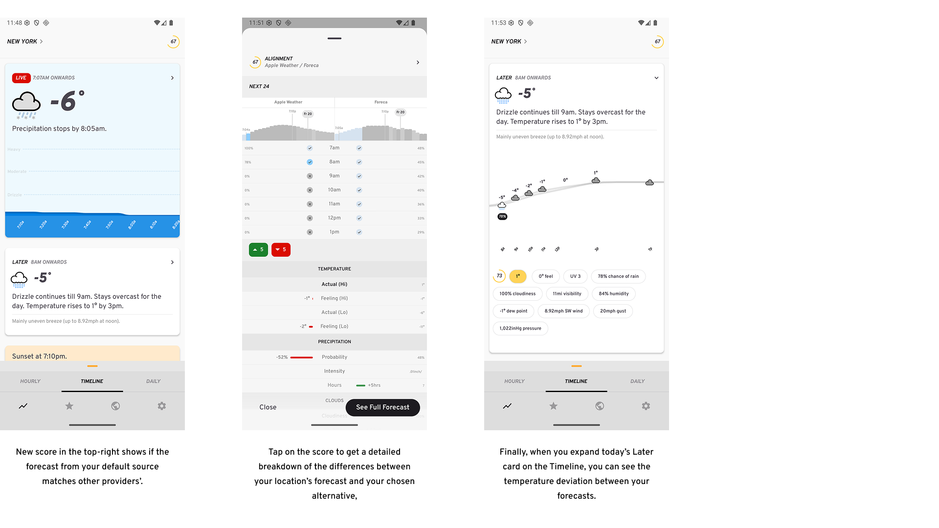
So how does it work?
The forecast from your default source is compared against a secondary source over the next 24 hours, using both weather conditions and temperature (you can change the secondary source in Settings → Sources). A perfect match scores 100. Anything lower means there are differences — the lower the score (0–100), the bigger they are.
Tap the score to see exactly where they differ.
You’ll also see upcoming temperature deviations between sources on the Timeline’s Later card. This feature will appear in more areas of the app over time — for example, Calendar subscriptions will soon highlight when your secondary source disagrees with conditions at key moments.
Note: This feature is available to Lightning Pro subscribers only. It effectively doubles your forecast request usage, therefore making it the most expensive feature to support.
There are a couple of other additions too:
-
The chart on the Hourly screen is now customisable: it defaults to 48 hours, but can now be changed to show 36, or 24 hours if you prefer. This is possible to change via Settings -> User Interface.
-
Settings screen has new items to leave feedback and view the app’s roadmap.
Improvements
-
You can now change the chart in the Daily screen to show only 7 days that has today as the first day, via Settings -> User Interface.
-
Time of day filters on the Daily screen have been moved underneath the chart, and are now always visible for improved discoverability/accessibility.
-
Days with precipitation expected on the Daily chart will now show a % probability besides its bar.
-
If it’s been 5 or more minutes since the last weather request and you resume the app, an auto-refresh occurs.
-
Comparison tables now show temperature low differences too.
-
Differences in temperature values in comparison tables are more pronounced.
Fixes
-
When there’s rain going into the weekend and over it too, the Next 7 summary will acknowledge this correctly.
-
On the Hourly chart, the sunrise/sunset/new day markers should always be visible and in an optimised spot (not obstructed by a bar).
-
A minimal difference between comparison data points should now display a minimal width bar highlighting this.
-
When temperature display is set to perceived, you don’t get two duplicate chips for actual/perceived temperature that both display the same value.
-
Additionally, they will be correctly labeled on comparison tables (not be referred to as actual temperature values).
-
Whereas if temperature display stays on the actual default, comparison tables will correctly show both actual and feels like values.
-
Finally, the comparison string on the Timeline will show the correct string (with a degree symbol besides the value difference) and value when we’re showing the perceived temperature.
-
-
When you refresh the weather (or change location) on the Hourly screen, all visible hour rows should update instantly (and not sometimes require you to scroll them out/in of view).
-
Settings screen has no excess bottom padding on foldables on the right pane.
-
Pull-to-refresh disabled on Settings screen’s right pane on foldables.
-
Markers on the Next 48 hours chart on the Hourly screen are always clearly visible, regardless of currently selected data point.